Hello and welcome to my portfolio!
Enjoy the scroll! If there is anything I can help you with, please get in touch!

AI Systems
UI & UX Design
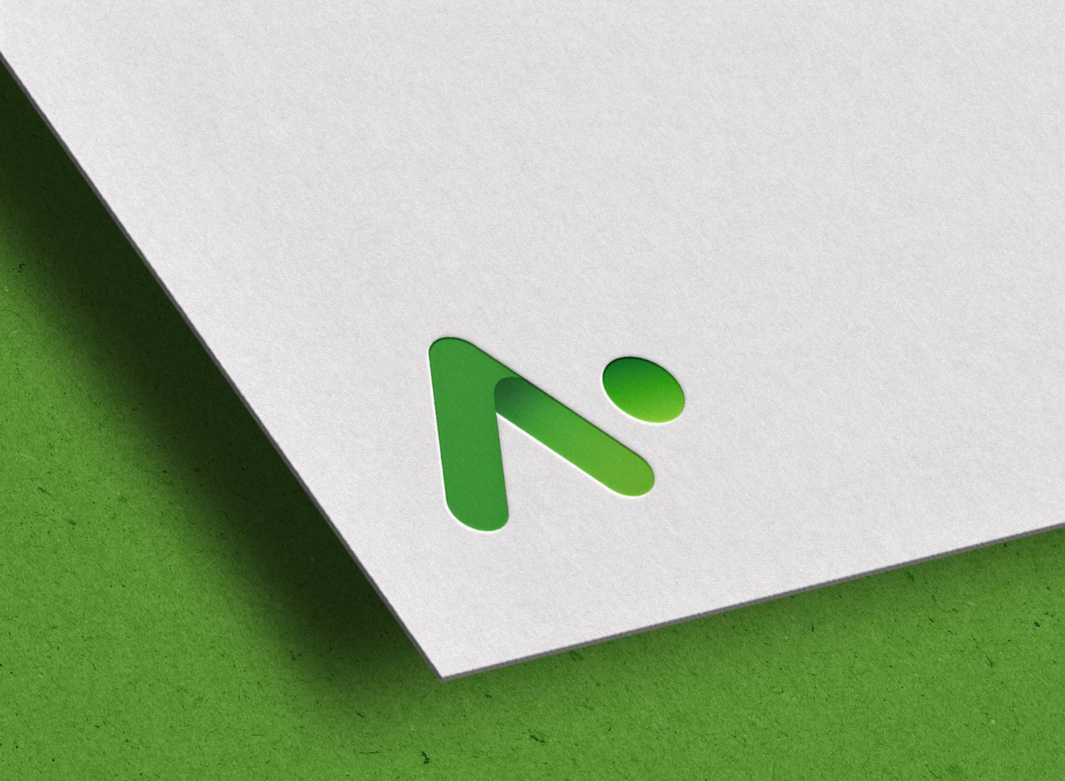
Alongside their rapid increase in clients, 4Tel split their Artificial Intelligence sector into a seperate, niche brand ‘AI Systems‘. This brand needed a visual identity and website, that completely disassociated it from 4Tel but implemented a sense of innovation and cutting edge technology.
The rebrand and website accompanied an industry and target audience analysis, wire-framing, user journey mapping, SEO optimisation and final build.
The website acting as the public identity of the company, had to instil trust, professionalism and expertise within the target audience.


4Tel
UI & UX Design
The 4Tel website was in a state of decay, it was not only visually outdated but the information displayed was either hard to navigate or had grown to be incorrect. This project required a complete UI and UX overhaul, including the migration from Joomla to WordPress.
Based off a fresh marketing strategy, market research and product matrix, a new and improved 4Tel was born.
This project included wire-framing, customer journey maps, user personas, prototyping and of course the migration and final build. Website navigation was significantly improved, clients found it easier and quicker to find the exact information they needed. The website now visually demonstrated its value and capability of technological innovation.


4Centr
UI & UX Design
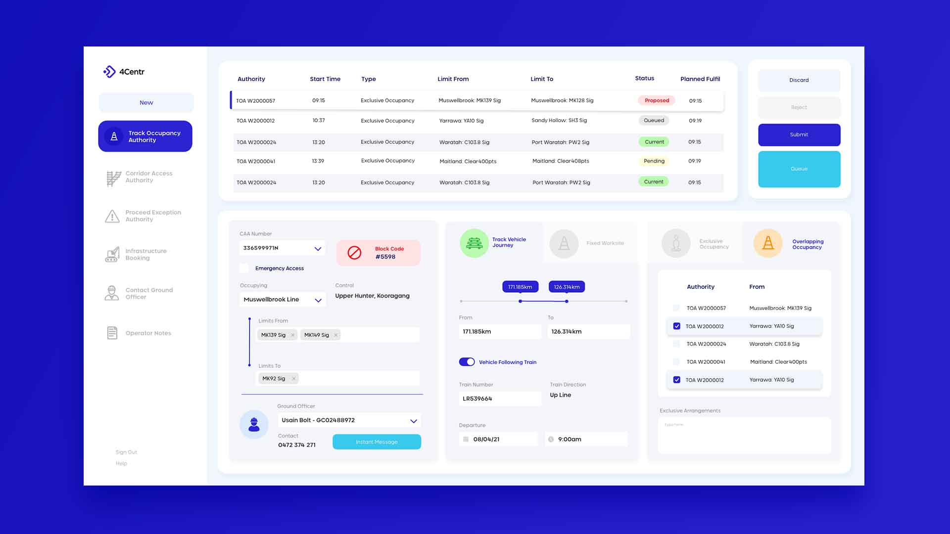
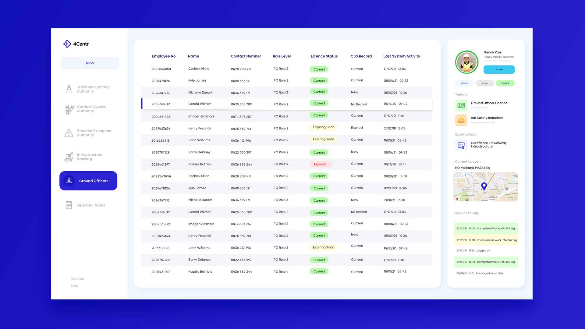
This digital platform was originally designed by software engineers. Apart from looking like an interface from Windows 98′, it more importantly lacked human-centred design, effecting Network Controller workflow efficency and therefore reducing safety of on-site rail work.
This project included extensive user-reaserch; from end-user interviews to customer journey maps, user personas, competitior analysis and of course prototyping with the end user. We visited the Network Controllers on site and spent a substantial amount of time observing their processes, workflow and therefore identifying their pain points with the old platform. After countless revisions and discussions with internal and external stakeholders over a diverse range of teams (including engineers and project administrators) an end platform was developed. The platforms navigation and functionality was significantly improved.
Newy Digital
Visual Identity
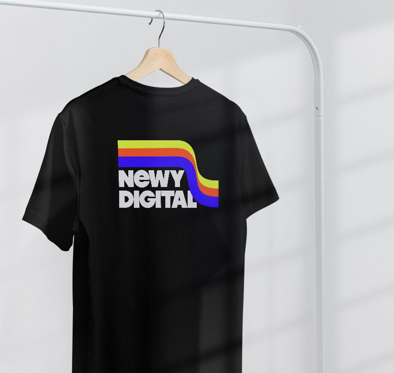
Expanding their business and subsequently shifting their client base, Newy Digital required a new visual brand identity including a logo design and visual assets package.
With the expansion of their team, target audience and refinement of their marketing strategy, they were after something edgy, something nostalgic and something with a hint of the 70s! This fresh identity captured their new edgy style, developed contrast between them and their competitors, and assisted with their USP.
The brand package included several logo versions including a vertical and square logo, a package of stylish visual assets (to be utilised on websites and for print documents), social media logos alongside numerous colour versions, a brand style guide booklet and document templates.





Teacher Professional Development
SOCIAL MEDIA CAMPAIGN
The Teacher Professional Development Calendar Campaign had a primary objective to encourage engagement and interaction with the posts! The exciting social graphics displayed below were developed to appeal to the target audience and client base (teachers) to share, comment and like in celebration of the exciting themed days celebrated within the classroom.


BRAND IDENTITY
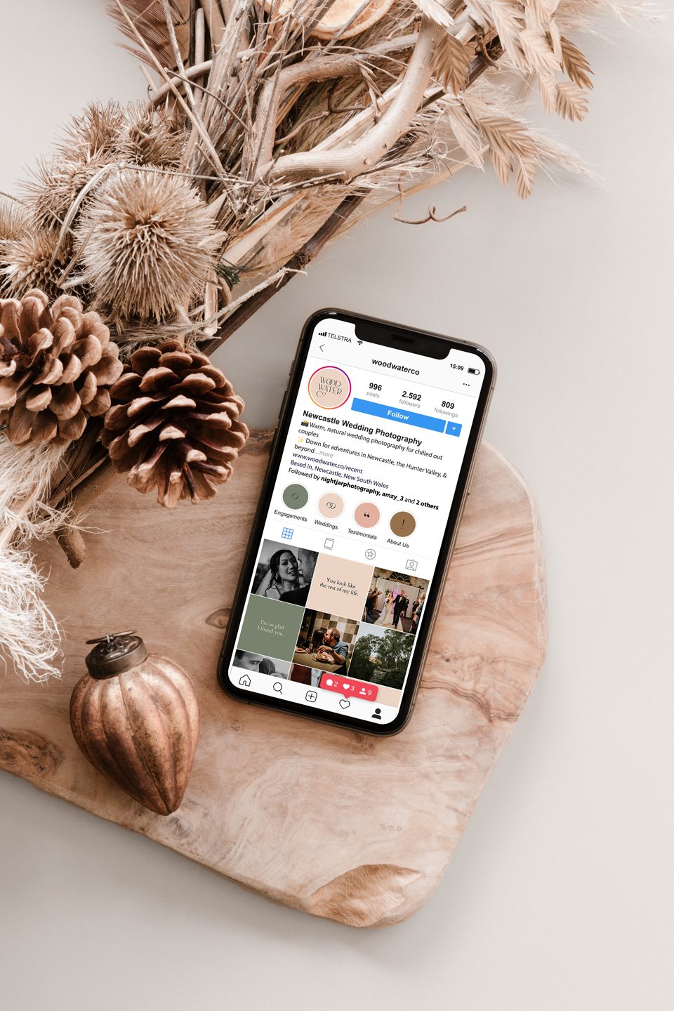
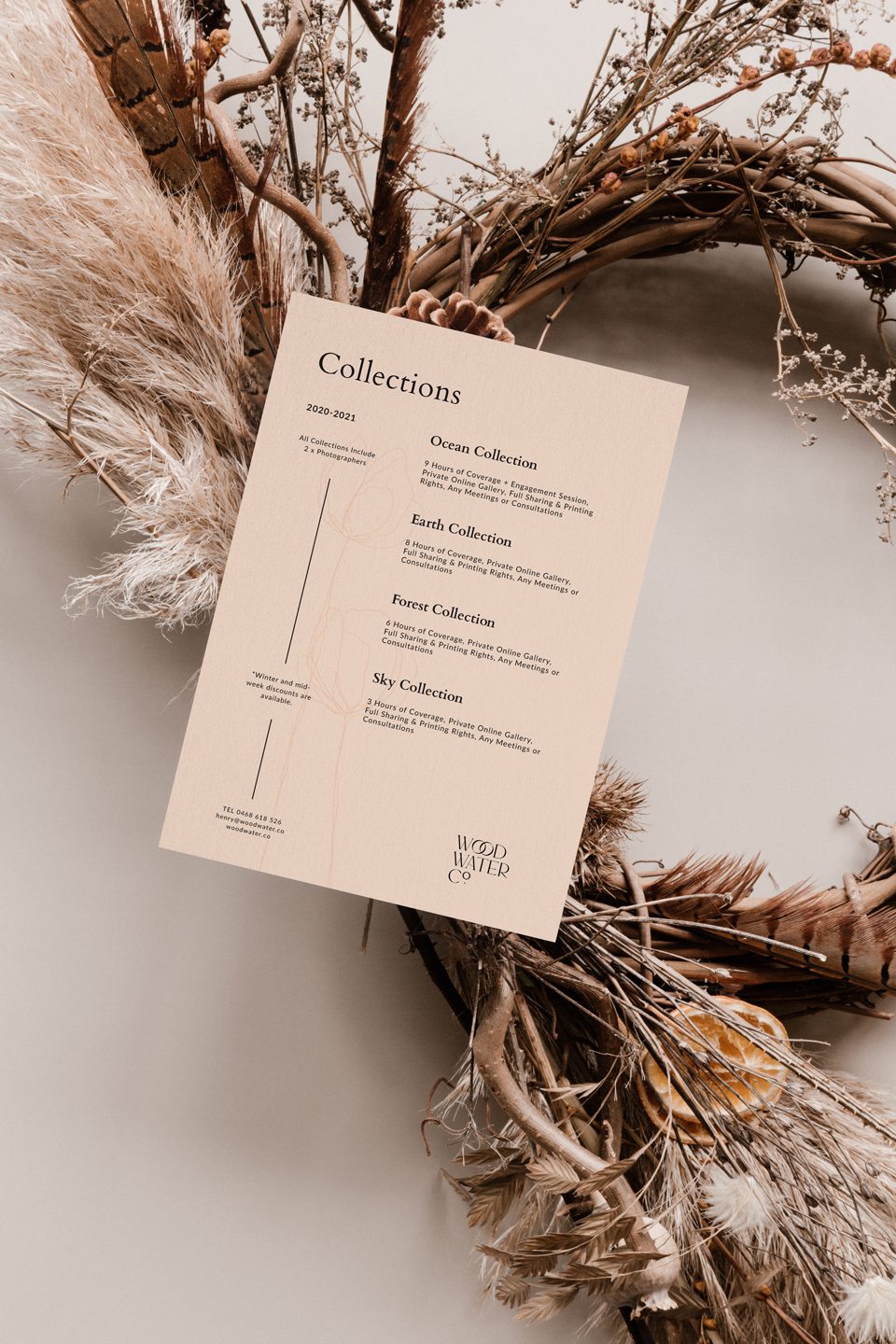
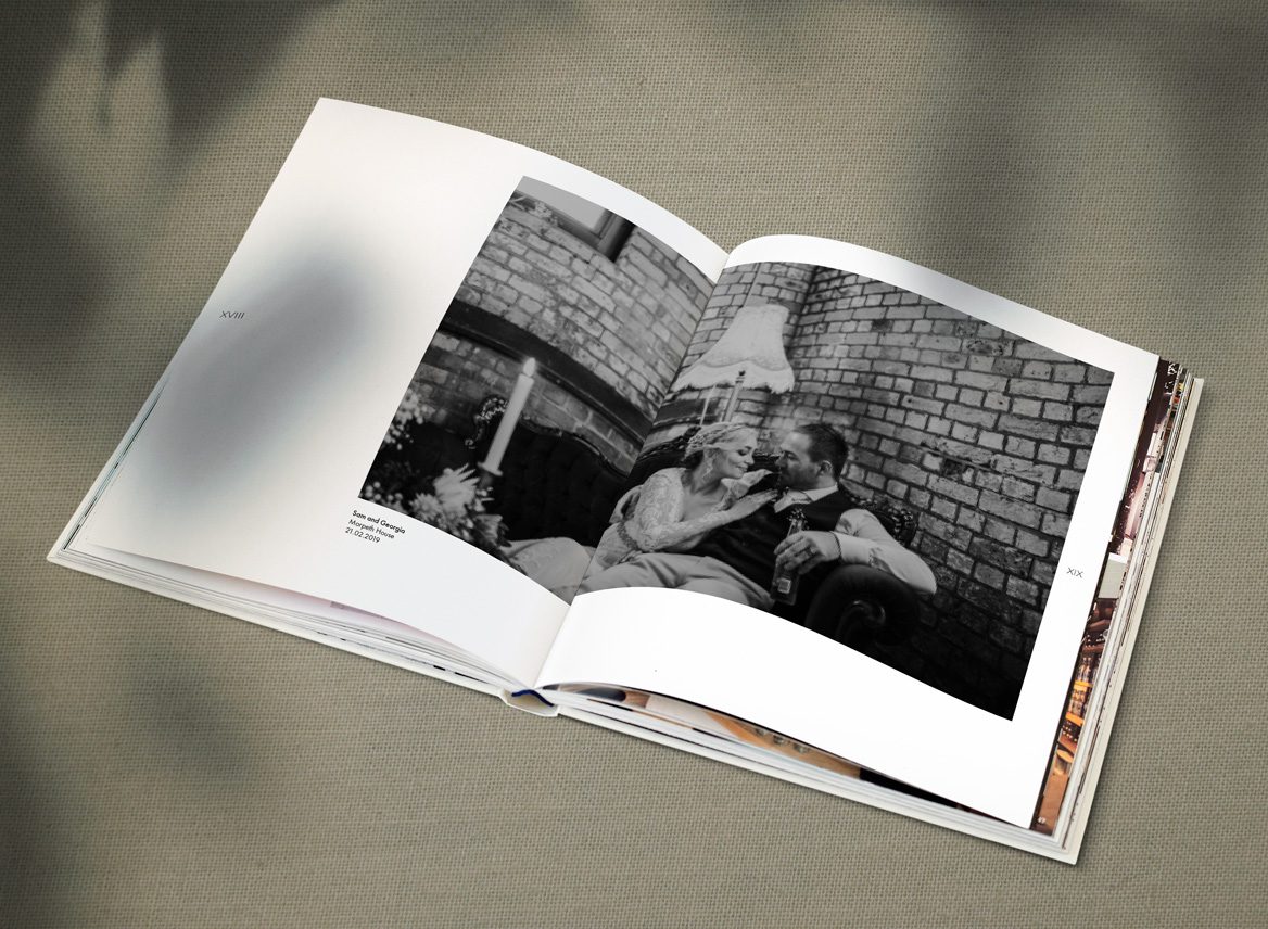
Wood Water Co is a wedding photography business based in Newcastle, NSW. Their photographs are out of this world! They inhabit an elegant and luxurious tone. This brand identity establishes and reinforces their higher standards of photography. The contemporary serif typeface embeds itself within the wedding industry, reinforced with the interlocking ‘O’s, symbolising of course two wedding rings and creating the form of the infinity symbol. But brands don’t cease at the logo, the identity involved various collateral designs including a ‘thank-you pack’ and social media marketing plan.
