Newy Digital
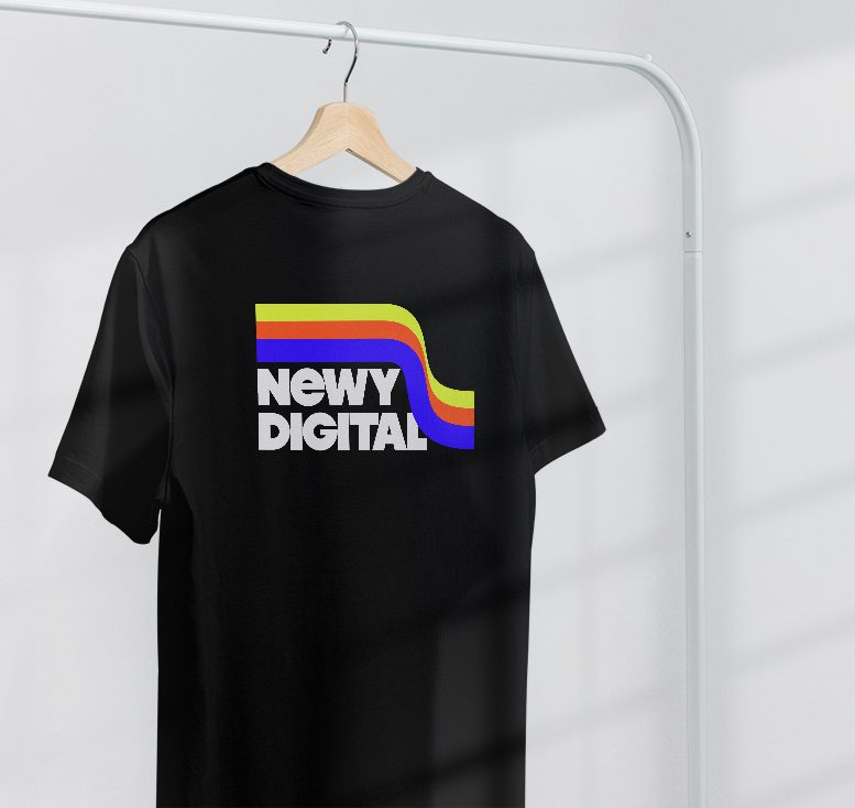
Expanding their business and subsequently shifting their client base, Newy Digital required a new visual brand identity including a logo design and visual assets package.
With the expansion of their team, target audience and refinement of their marketing strategy, they were after something edgy, something nostalgic and something with a hint of the 70s! This fresh identity captured their new edgy style, developed contrast between them and their competitors, and assisted with their USP.
The brand package included several logo versions including a vertical and square logo, a package of stylish visual assets (to be utilised on websites and for print documents), social media logos alongside numerous colour versions, a brand style guide booklet and document templates.




Teacher Professional Development
SOCIAL MEDIA CAMPAIGN
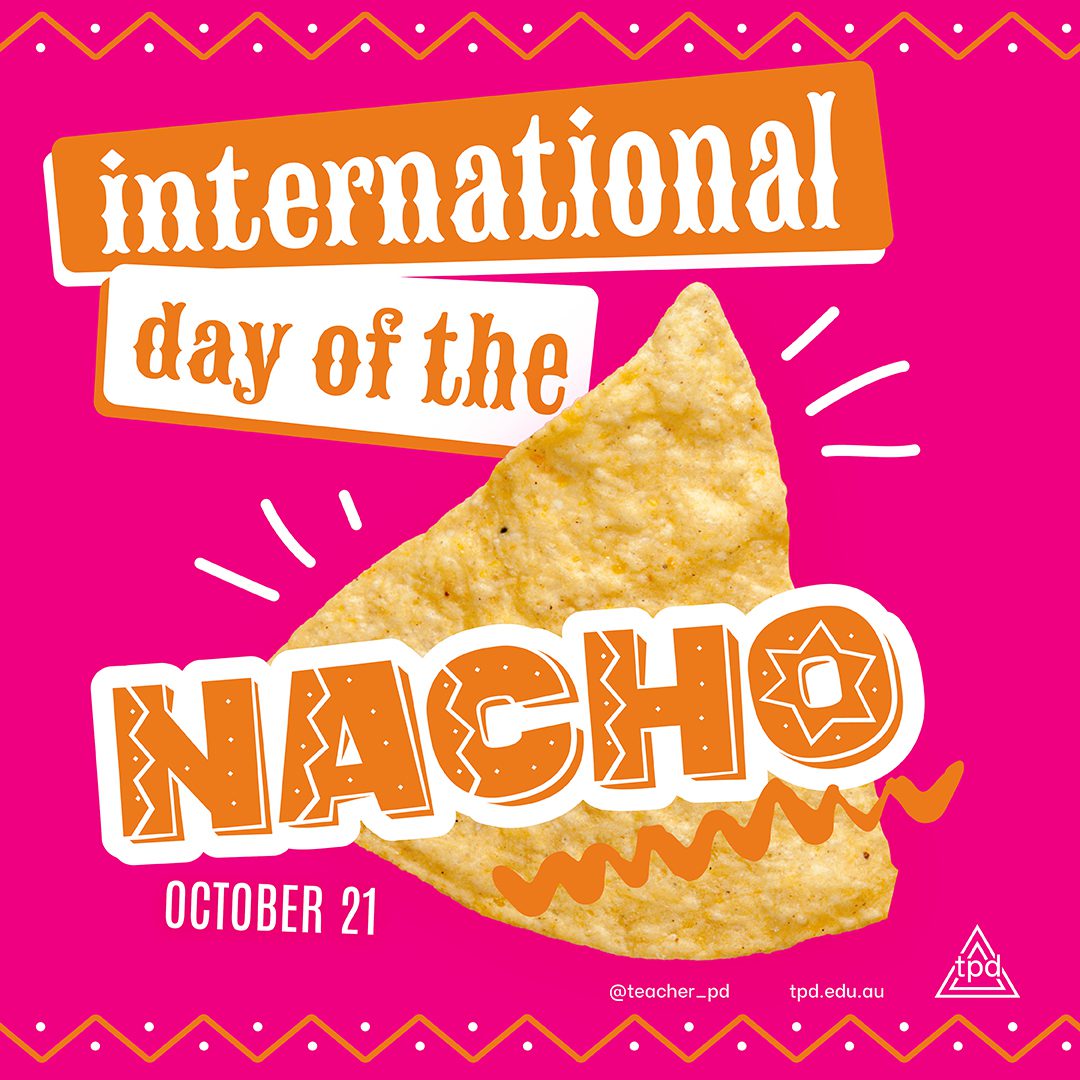
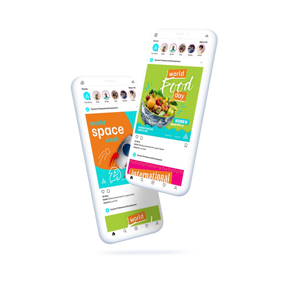
The Teacher Professional Development Calendar Campaign had a primary objective to encourage engagement and interaction with the posts! The exciting social graphics displayed below were developed to appeal to the target audience and client base (teachers) to share, comment and like in celebration of the exciting themed days celebrated within the classroom.
Wests Group
CAMPAIGN DESIGN
I have completed an 100 hour internship at Wests New Lambton with their marketing team, and it was the most rewarding thing I’ve ever done. They not only let me have free range on some of their promotional material but I was also able to work with their marketing team, receive invaluable feedback and industry advice.

The ‘Spin Till You Win Campaign’ was a renewal brief. The brief originally was to just change the background colour but I wanted to take it further so I decided to not only change the colour but create a spray of glitter & rays of light from the text. Which responded very well with the team and it was approved from management.

The Fun Free Fizz campaign needed collateral to promote a free Wizz Fizz for every jug of soft drink sold!
The brief stated that the red bar was not to be altered and it needed to include the Wizz Fizz product imagery. I took inspiration from the Wizz fizz brand and created eye catching, fun visuals to promote the campaign to diners.

Part of the Wests Group Brand, The Balance Essentials 101 Master Class collateral design is a combination of attention to detail, layout design and sourcing imagery.

BRAND IDENTITY
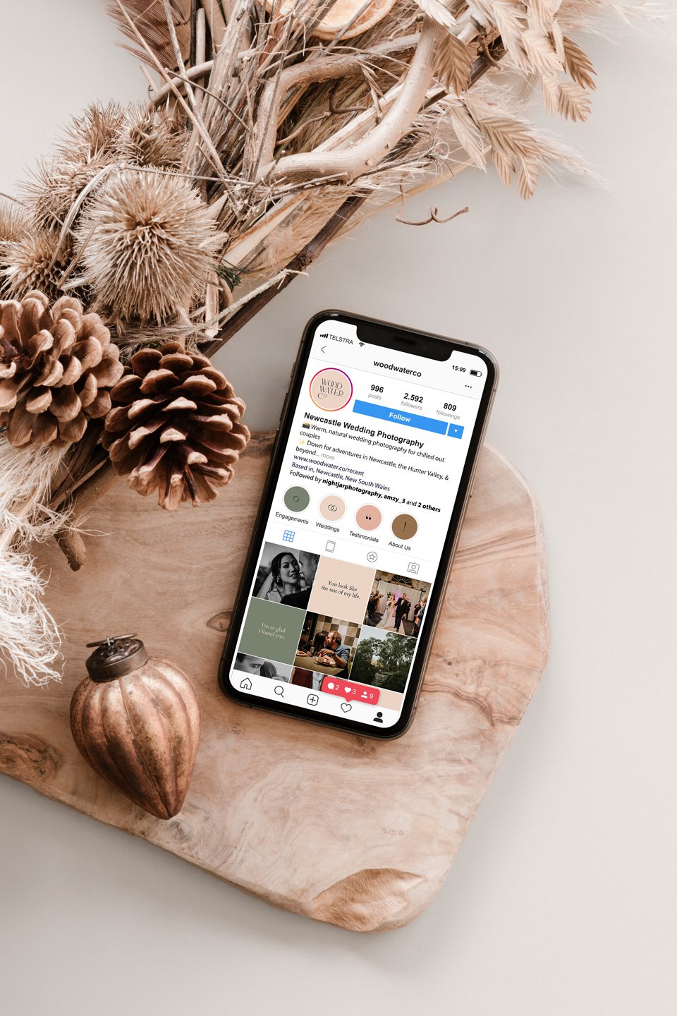
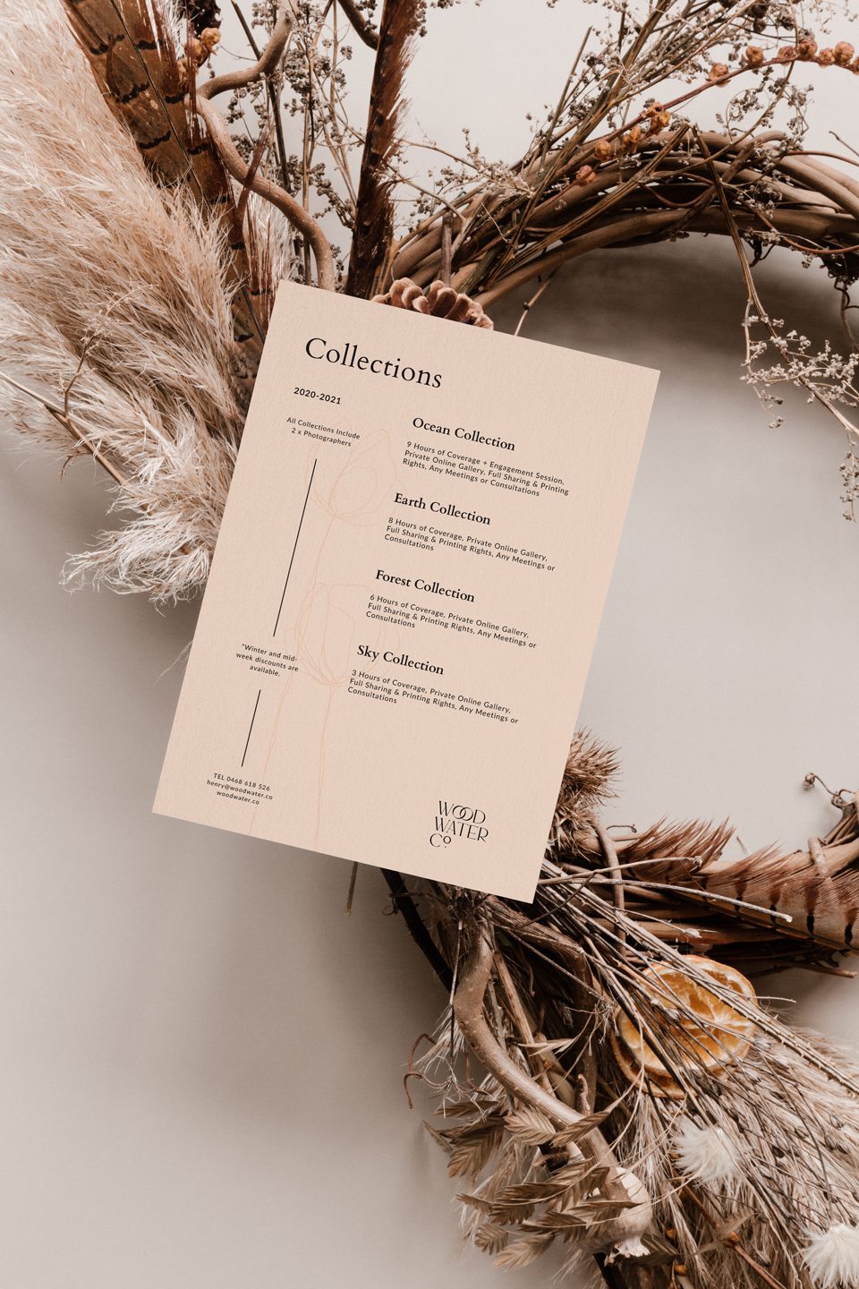
Wood Water Co is a wedding photography business based in Newcastle, NSW. Their photographs are out of this world! They inhabit an elegant and luxurious tone. This brand identity establishes and reinforces their higher standards of photography. The contemporary serif typeface embeds itself within the wedding industry, reinforced with the interlocking ‘O’s, symbolising of course two wedding rings and creating the form of the infinity symbol. But brands don’t cease at the logo, the identity involved various collateral designs including a ‘thank-you pack’ and social media marketing plan.

Sunnyside Tavern
BRAND IDENTITY
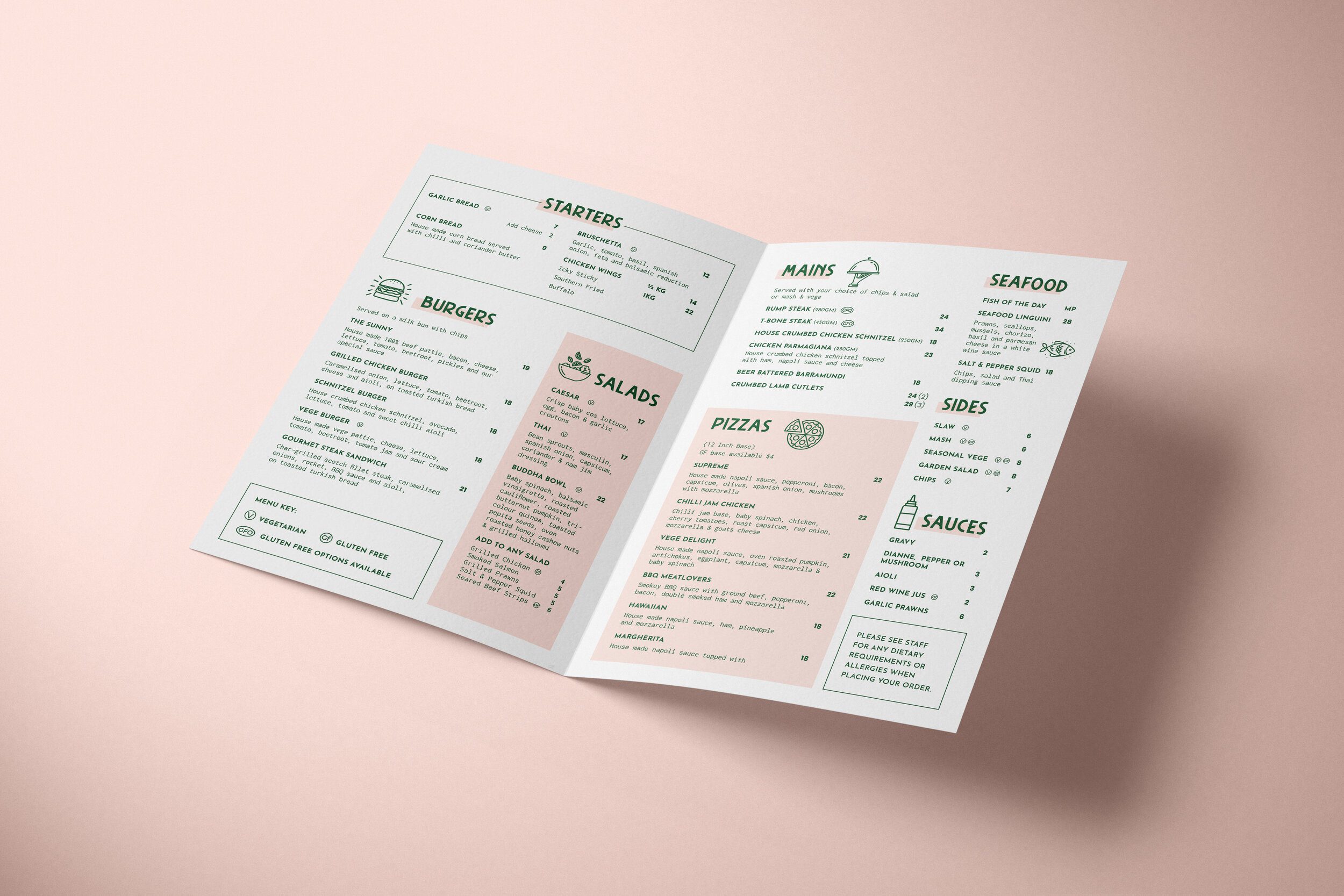
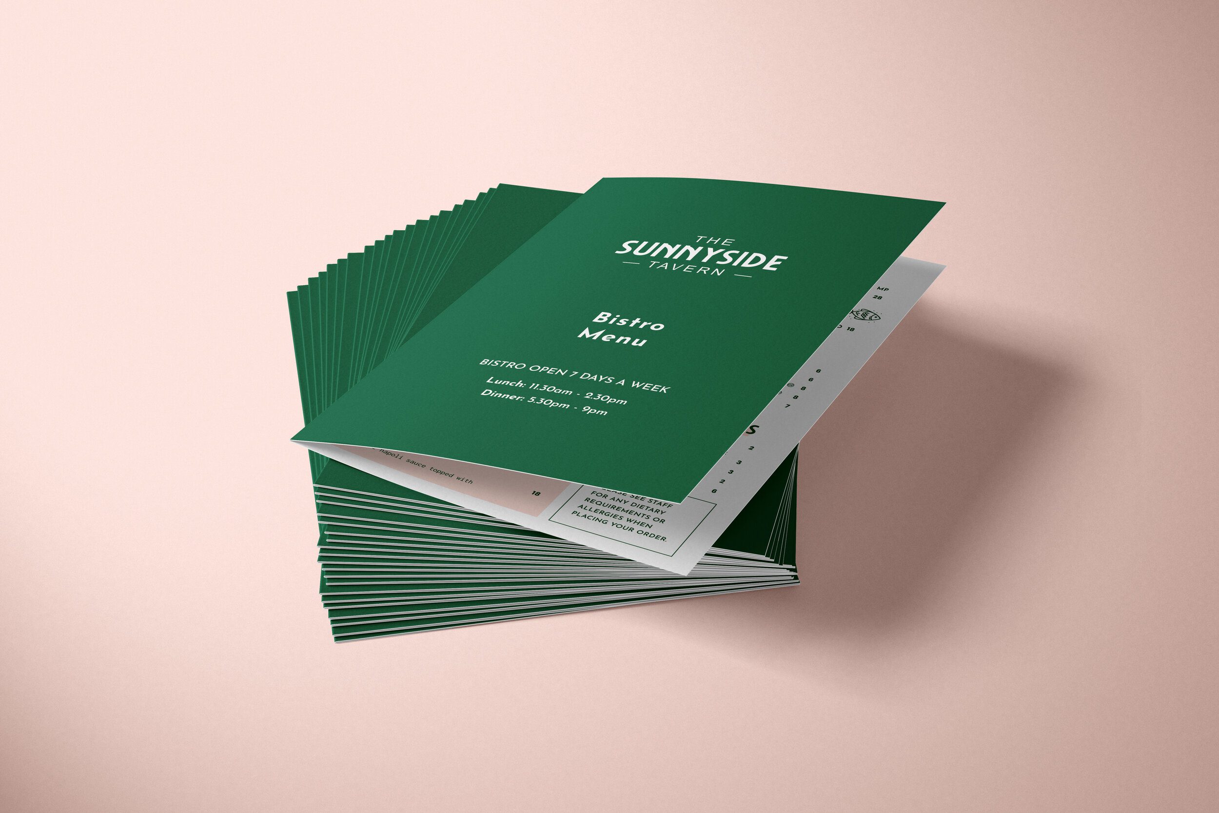
New owners, new look! This quirky little pub located in the tiny suburb of Georgetown, NSW needed a fresh new identity and collateral to appeal to their younger and more family driven target audience!

The Mayfield Hotel
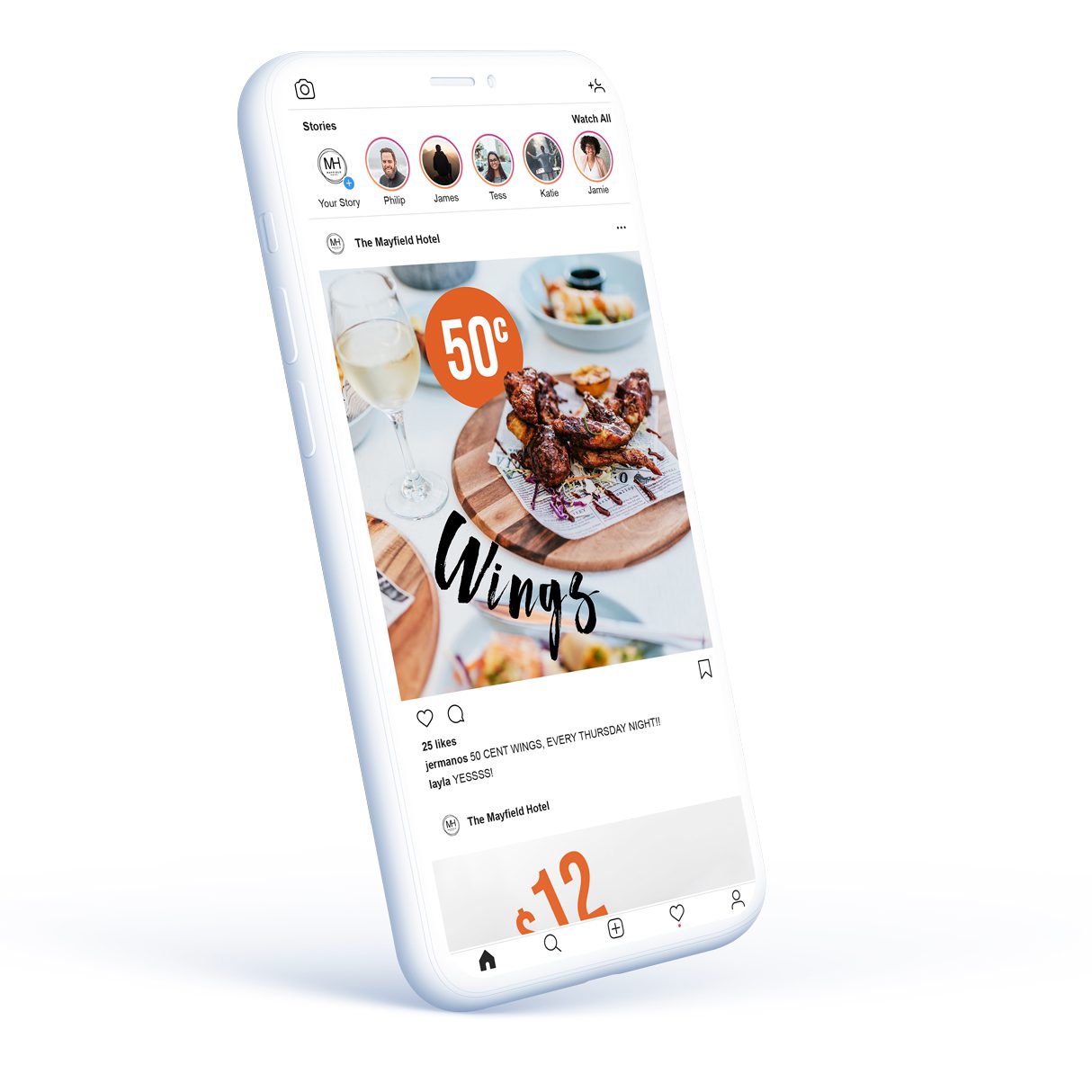
SOCIAL MEDIA CAMPIGN DESIGN
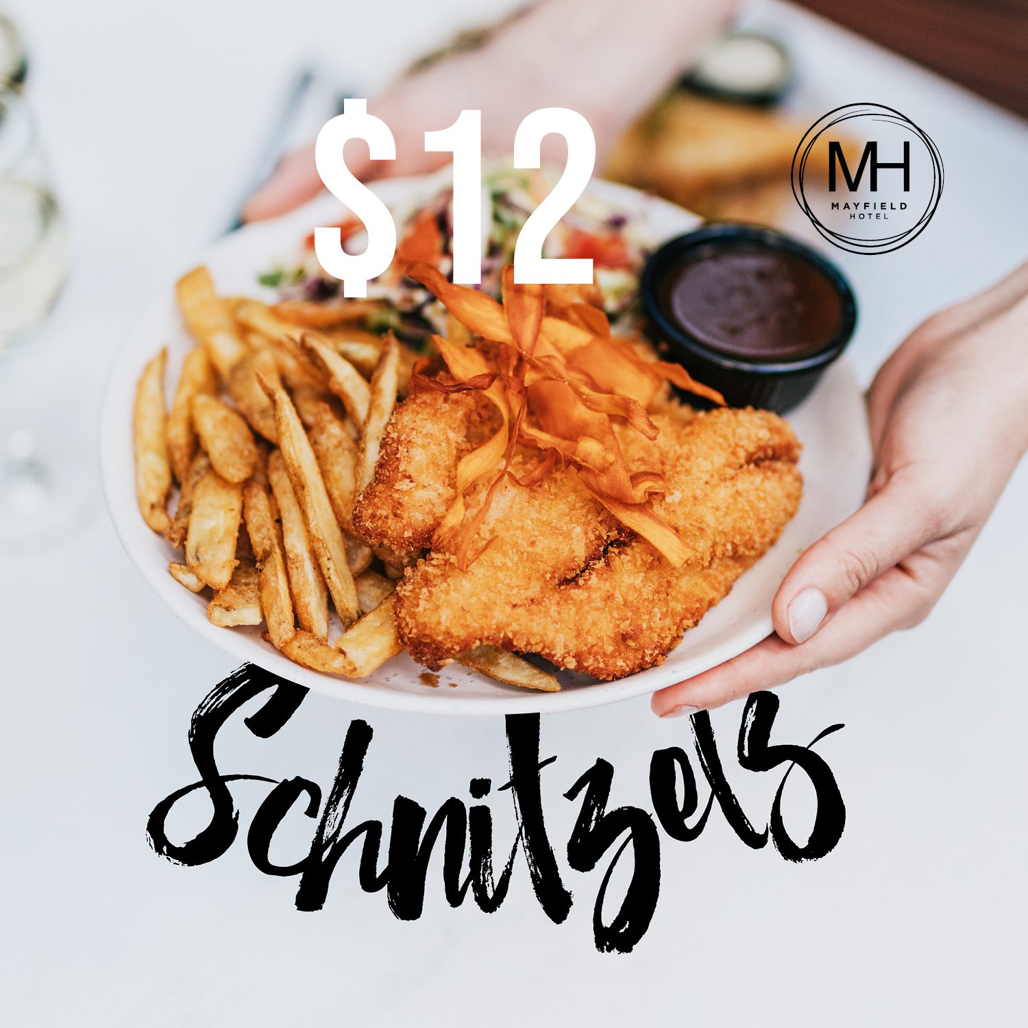
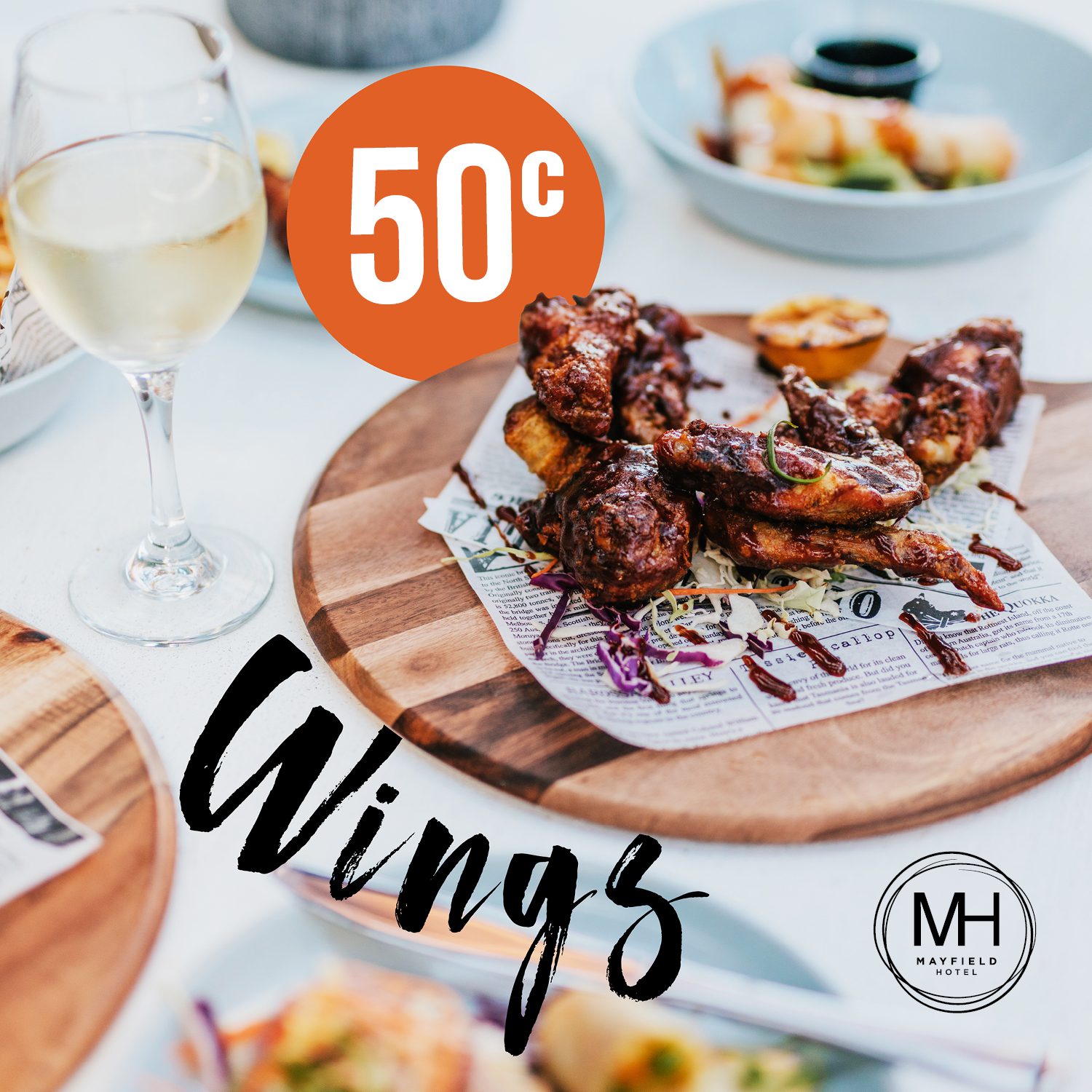
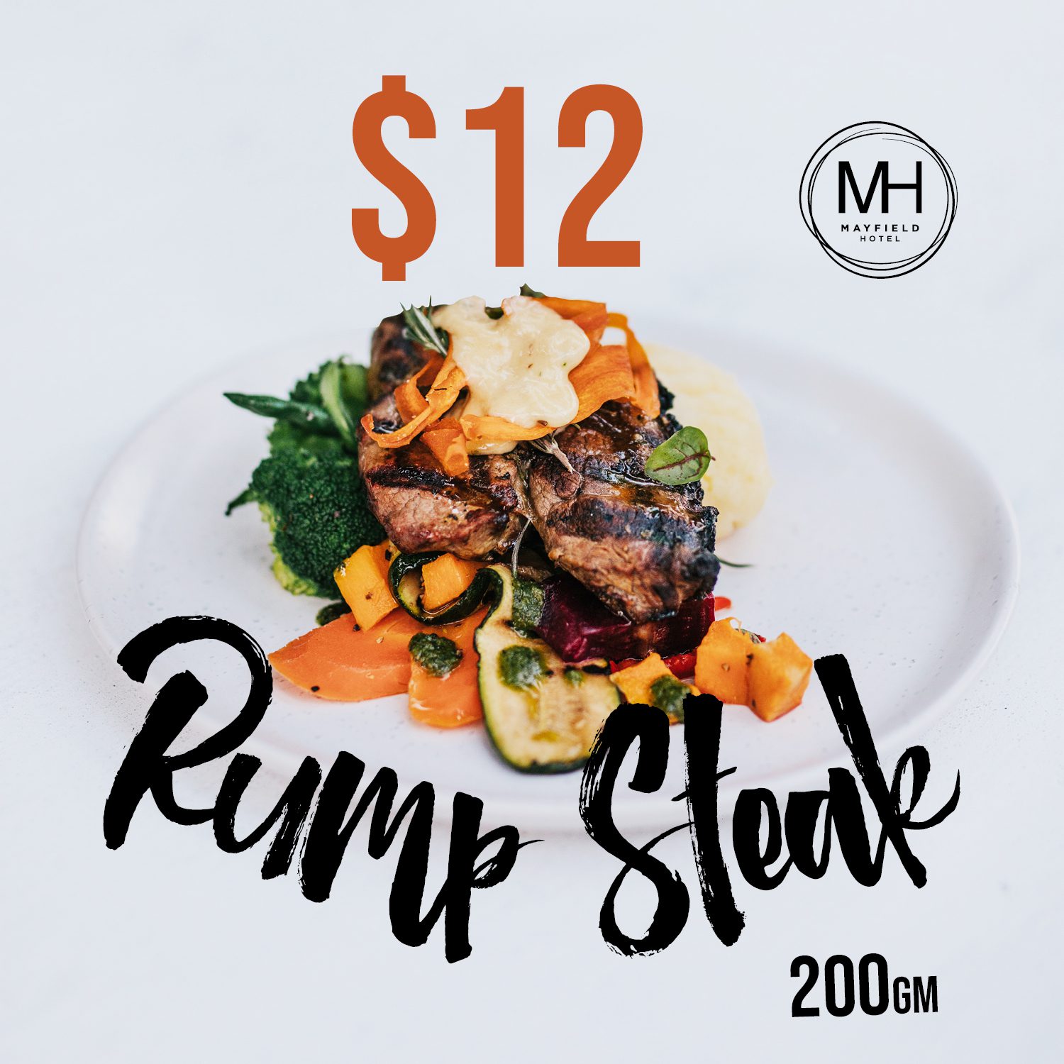
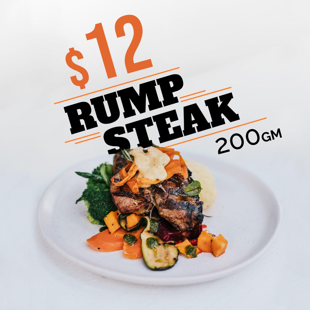
Promoting The Mayfield Hotel’s various dinner promotions, this campaign utilizes photos from an earlier photo shoot, accompanied by text and edited to maintain a cohesive social
Watt Space Gallery
BRAND IDENTITY
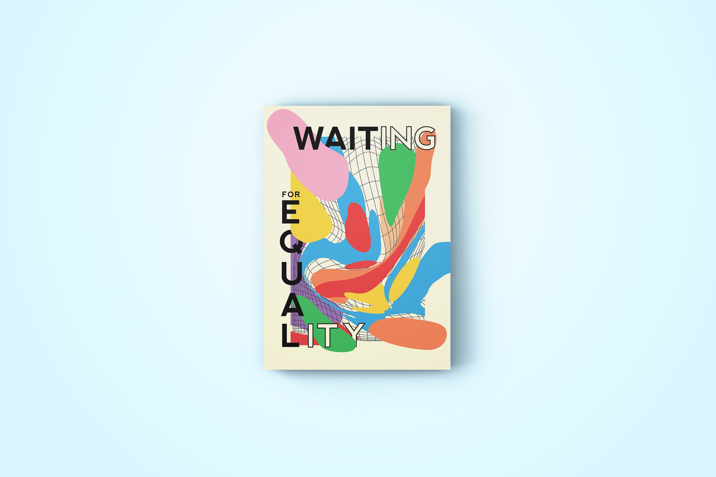
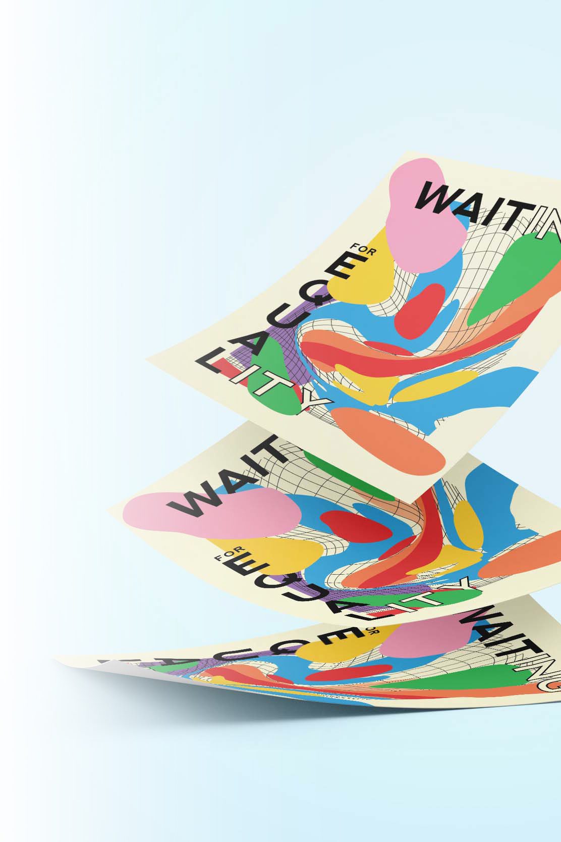
“Waiting For Equality” is the stark reality for many LGBTIQA+ Australians. Watt Space Gallery desired to highlight the inequality and social stigmas that still cloud the LGBTIQA+ community but also celebrate the recent progression of rights.
This design depicts the LGBTIQA+ community as individual blobs, each unique but so susceptible to time itself, which is represented by the grid. Their lives and future are shaped by this endless factor which diverges and morphs with time.

Stripey Shirt
BRAND IDENTITY
Stripey Shirt is a Wedding Photography business based in Newcastle, NSW. This branding identity and logo design depicts the stylish, colourful and vibrant photographs which are produced by Stripey Shirt through the use of illustration & typeface.

Iceland Travel App
UX AND UI DESIGN
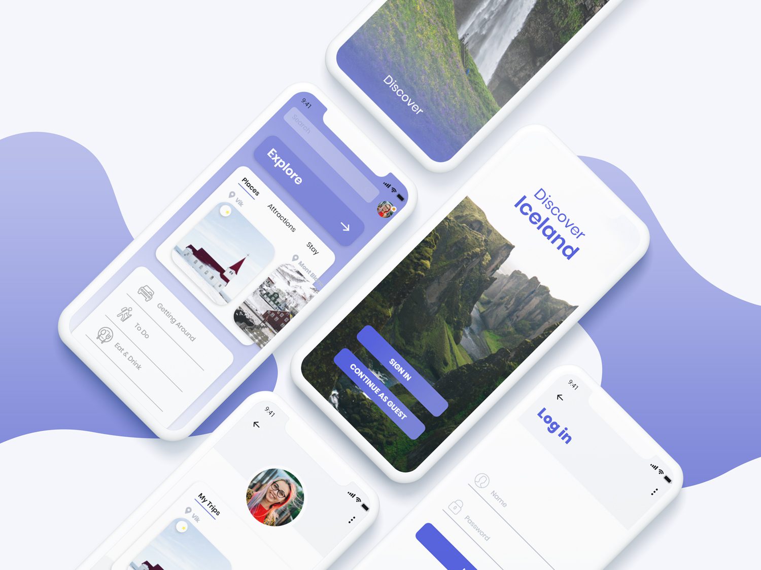
The all in one travel app to Iceland! Users are able to explore beautiful natural attractions, destinations, book accommodation, plan trips through the in built trip planner (which co-insides with the public transport schedule), browse, reserve seating and even rate local restaurants and bars without ever leaving the app! There is an ‘explore’ feature which allows the audience to browse all categories with ease. On the opening screen the audience is prompted to ‘sign in’ and make a profile – alternatively they can continue as a guest, but by signing in they can ‘save’ destinations, hotels and restaurants to summarize or allow them to revisit quickly later.

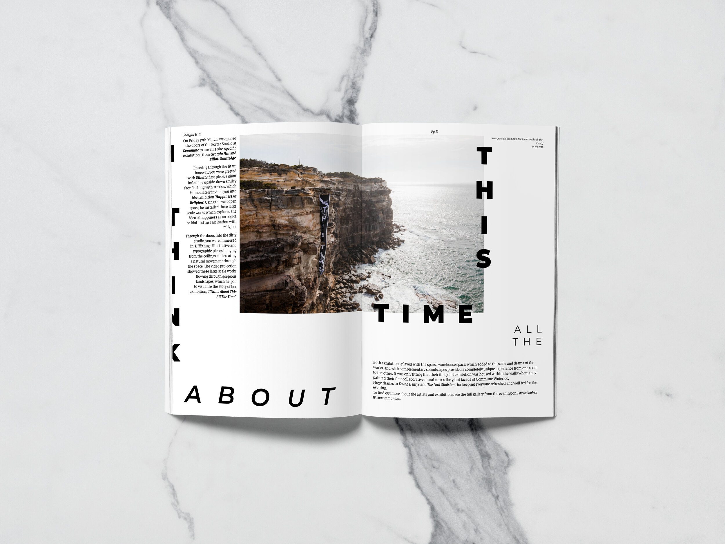
Georgia Hill Zine
LAYOUT DESIGN
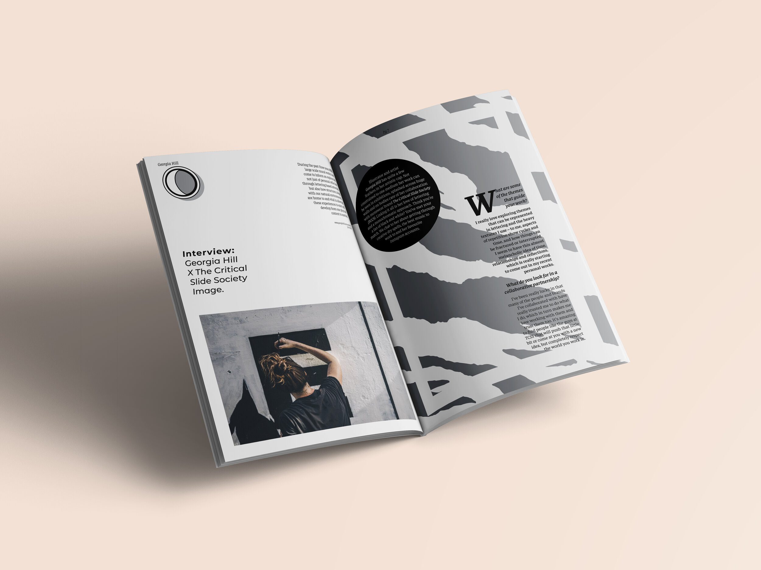
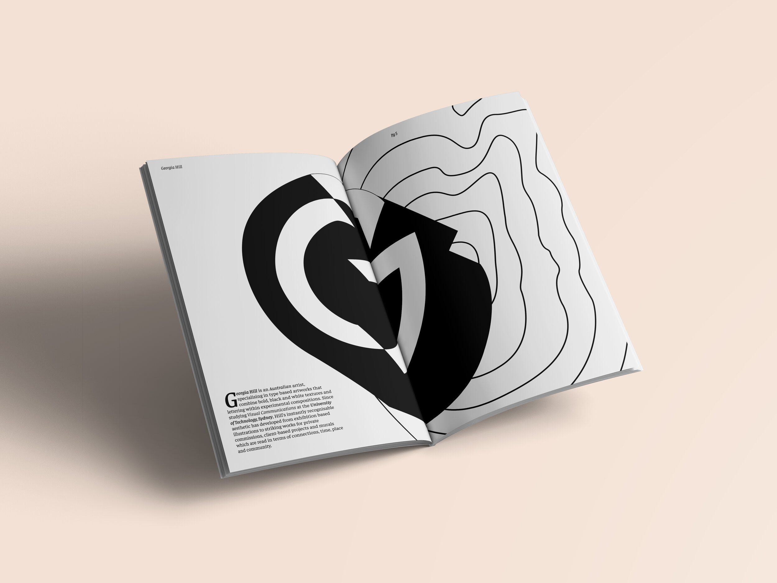
A zine dedicated to the skilled Australian Designer, Georgia Hill. Much like Hill, this zine explores type as an image, type hierarchy, a vast array of layout and pattern exploration.


