Woodwater Co.
“I look at you and I’m home.”
Background
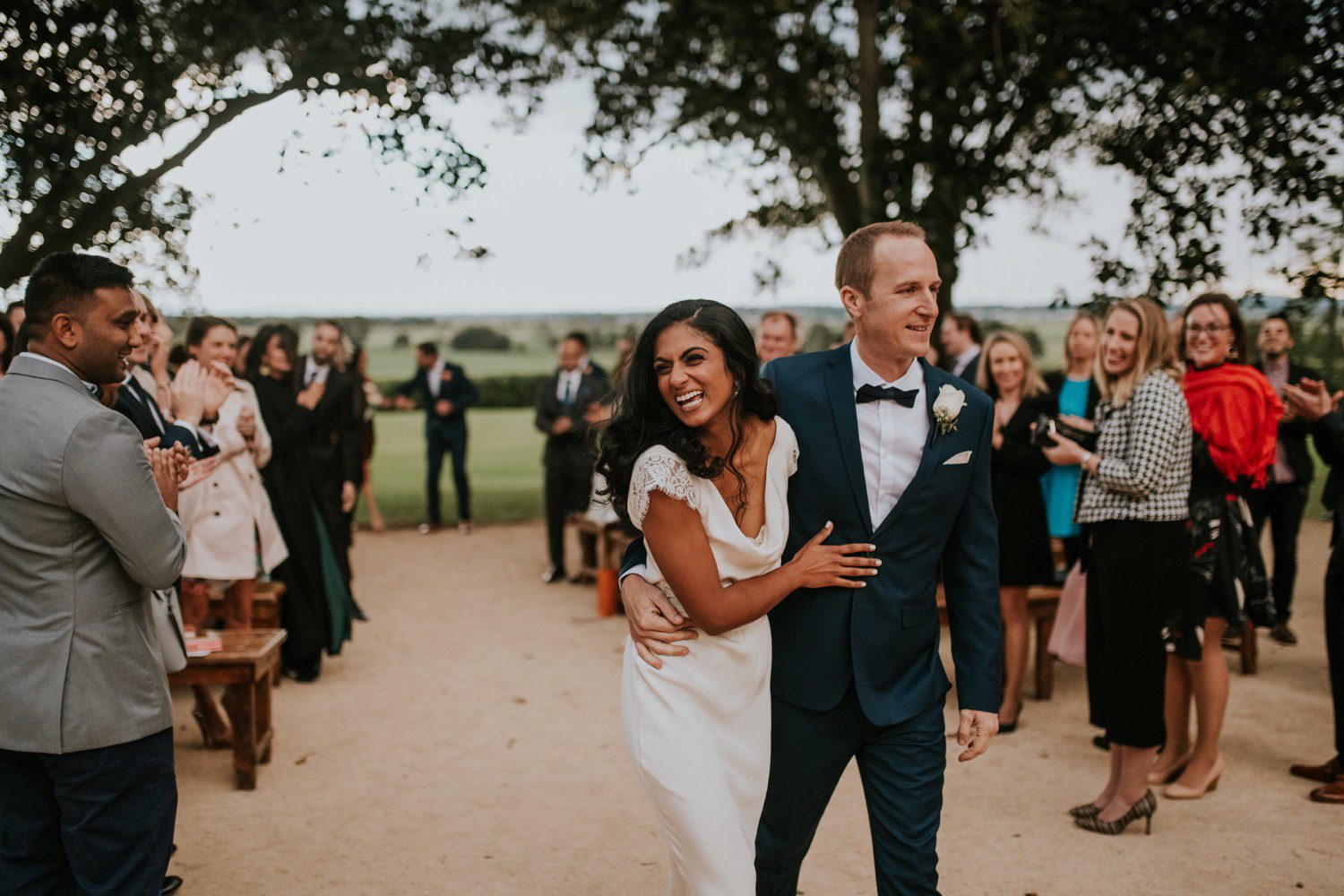
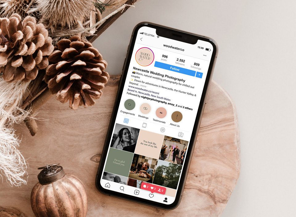
Wood Water Co were after an updated brand and logo design to reinstate the luxuorious and upper class nature of their wedding photography business, located in Newcastle NSW. Their photographs are out of this world! They inhabit an elegant and luxurious tone, mixed with a dash of fun and party!

Scope
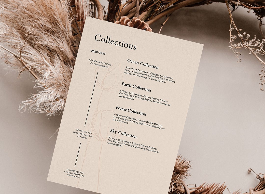
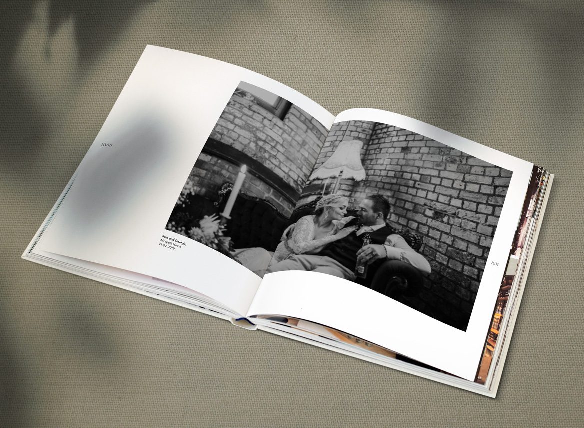
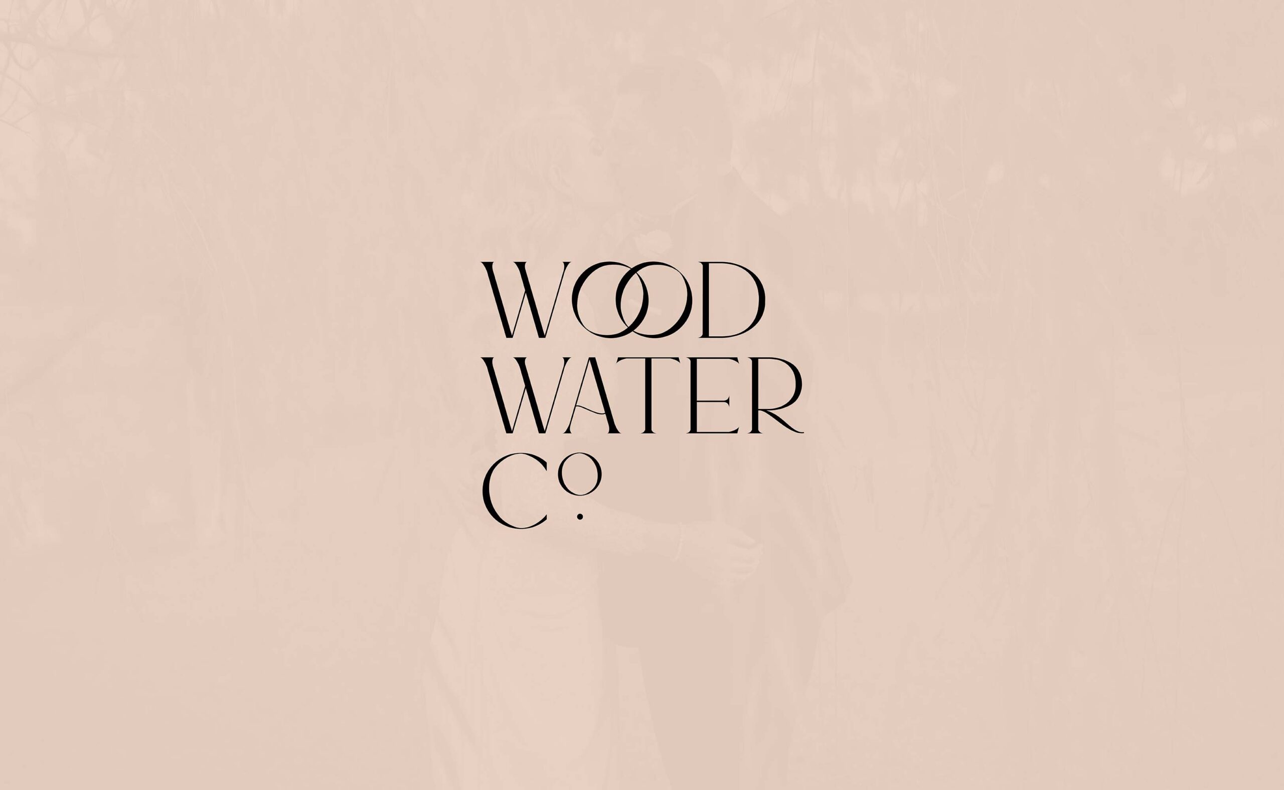
This brand identity establishes and reinforces their higher standards of photography. The contemporary serif typeface embeds itself within the wedding industry, reinforced with the interlocking ‘O’s, symbolising of course two wedding rings and creating the form of the infinity symbol. But brands don’t cease at the logo, the identity involved various collateral designs including a ‘thank-you pack’ and social media marketing plan.
